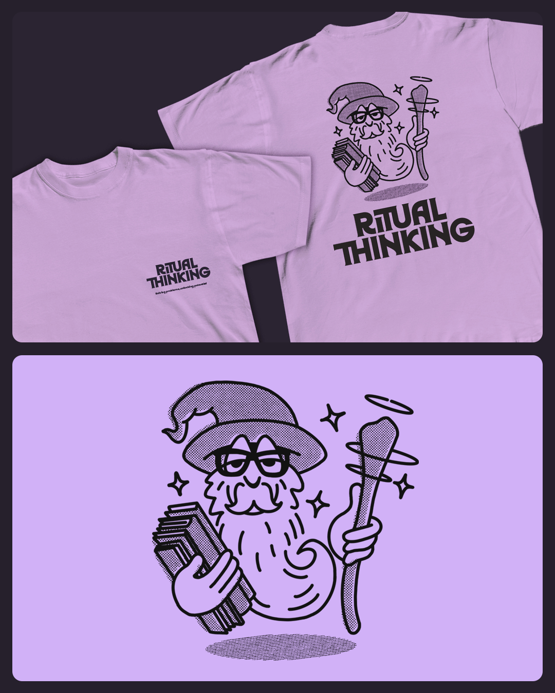
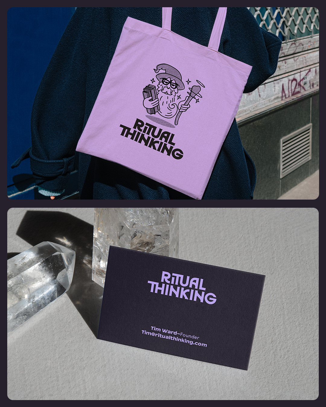
Such a pleasure to work on the branding for Ritual Thinking – a company running workshops rooted in design thinking to solve problems, drive innovation and bring teams together. Founder Tim sees a certain magic in this approach: when people collaborate to tackle challenges, they feel more united and invested in the outcome.
The name reflects both rituals – collective acts that sync groups and unlock higher reasoning – and design thinking, the foundation of the workshops. With this ‘magical ritual’ in mind, we built a palette of purples linked to mysticism, wisdom and creativity, drawing inspiration from the 70s New Age movement where psychology and mysticism met.
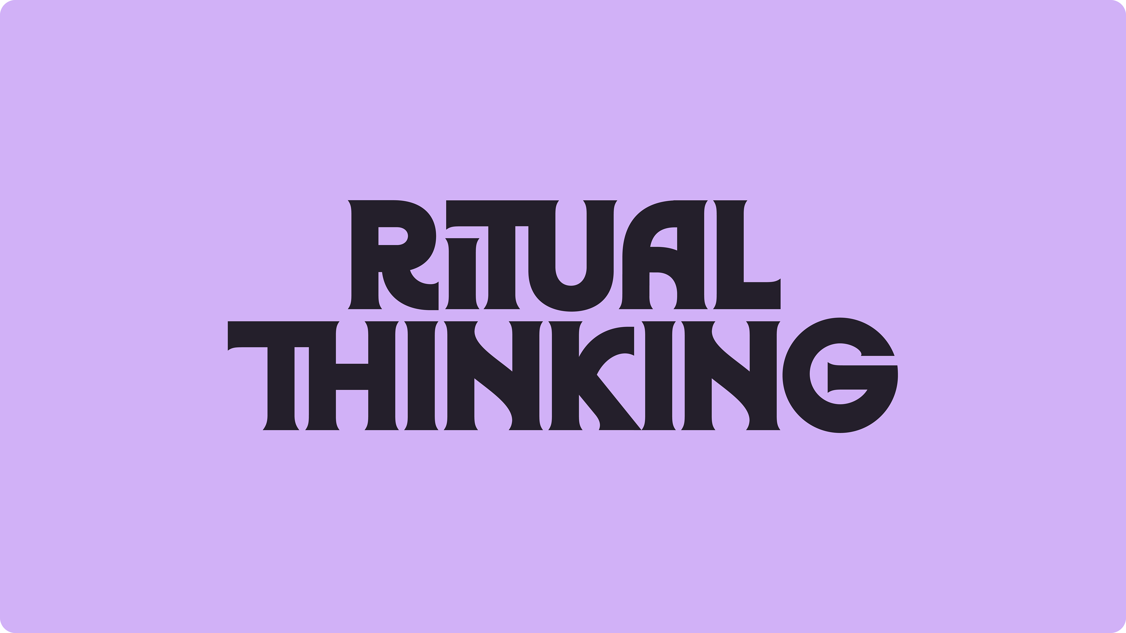
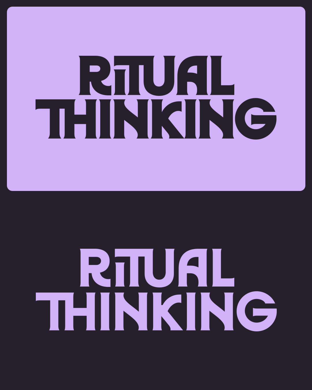
The wordmark also nods to that era, inspired by the type on books from the time. Interlocking forms symbolise unity, and a shaman mascot (with more than a hint of Tim) brings humour and levity – balancing the serious thinking behind the workshops with the fun and personality Tim is known for.
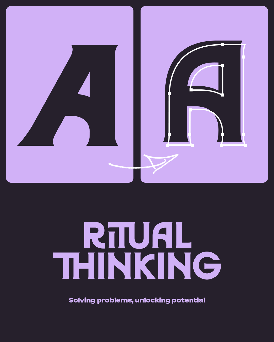
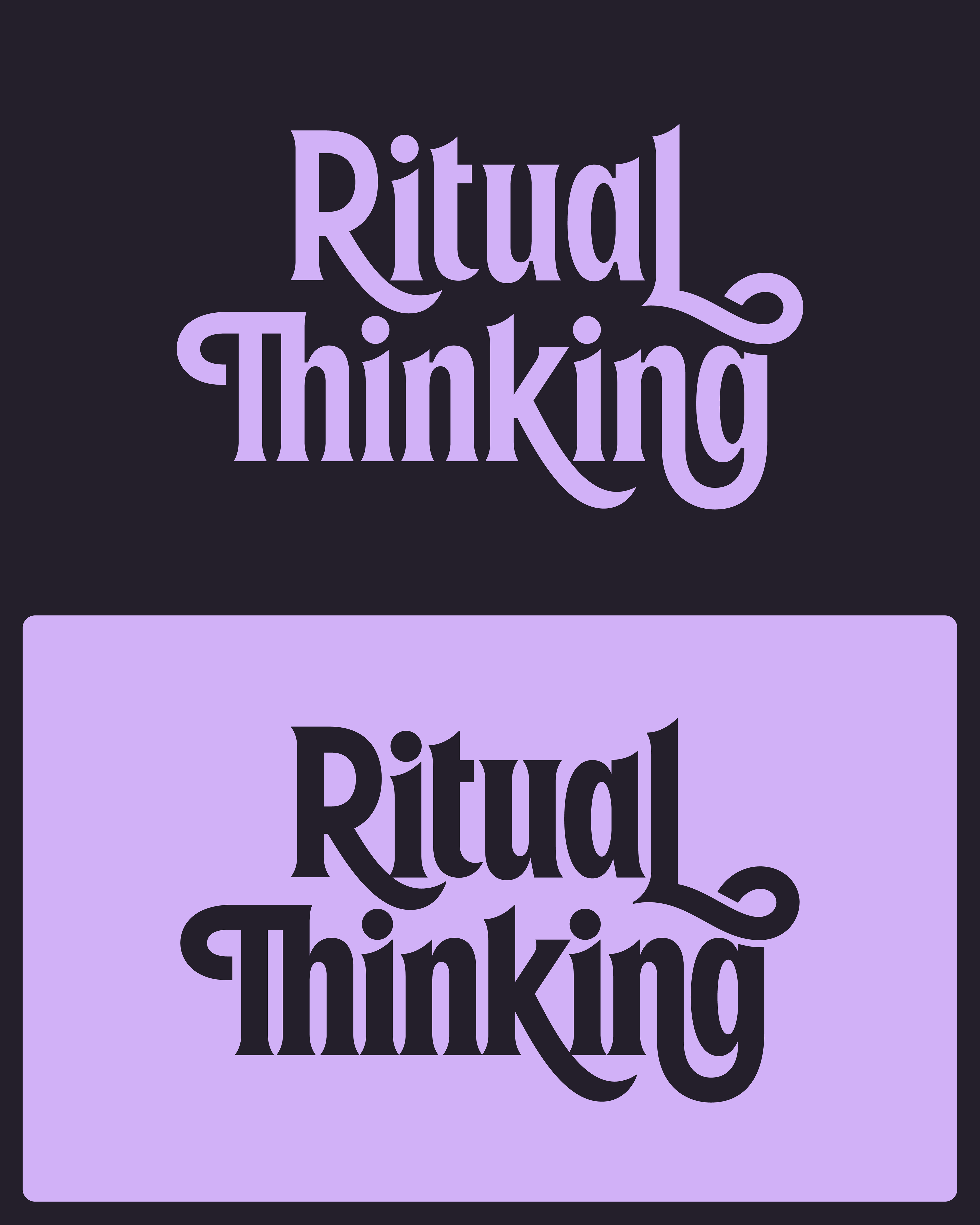
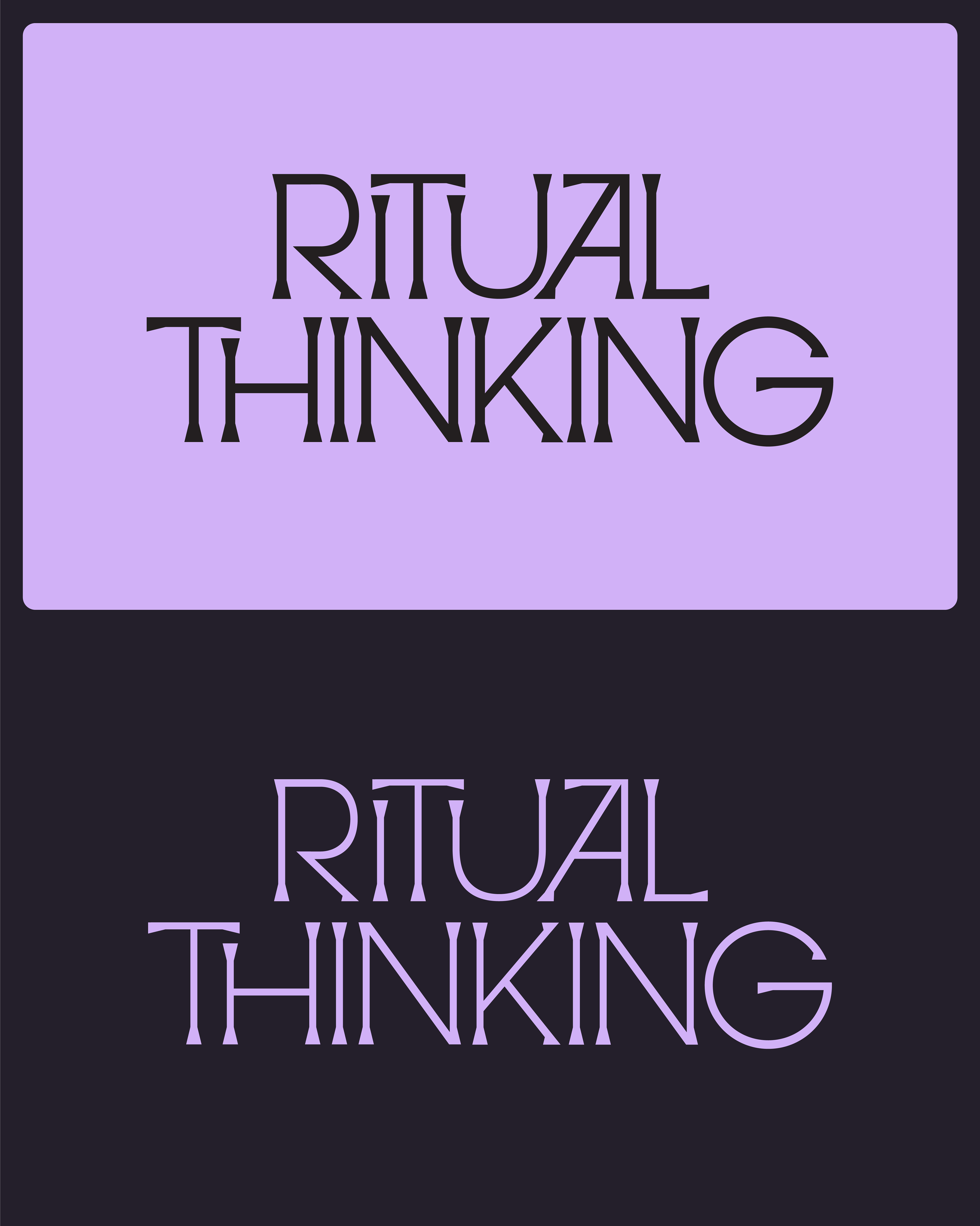
During the concept stage we played around with a number of different options, these are two more that were shortlisted, before deciding on the final wordmark.