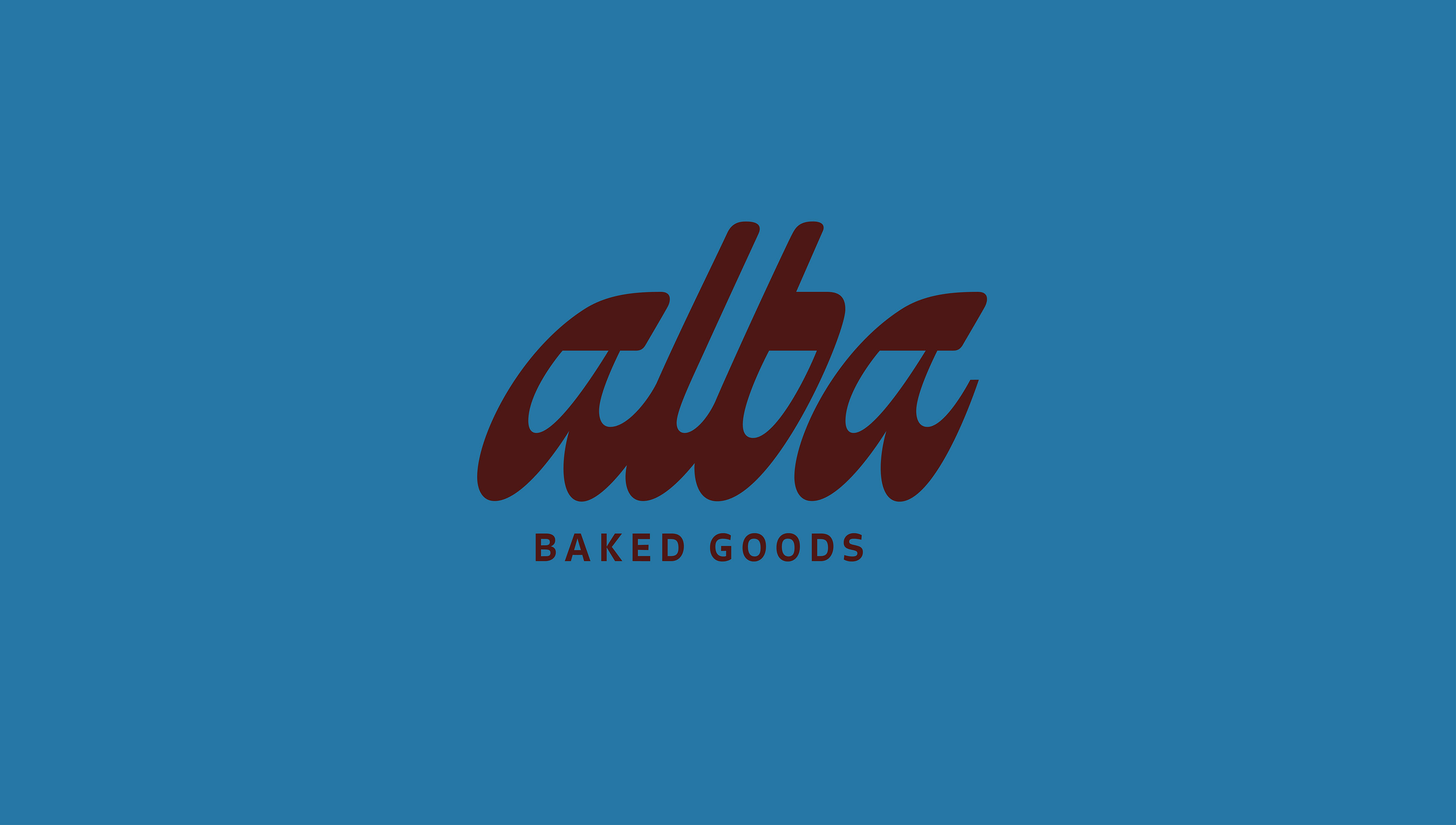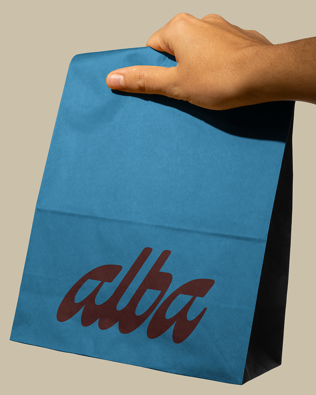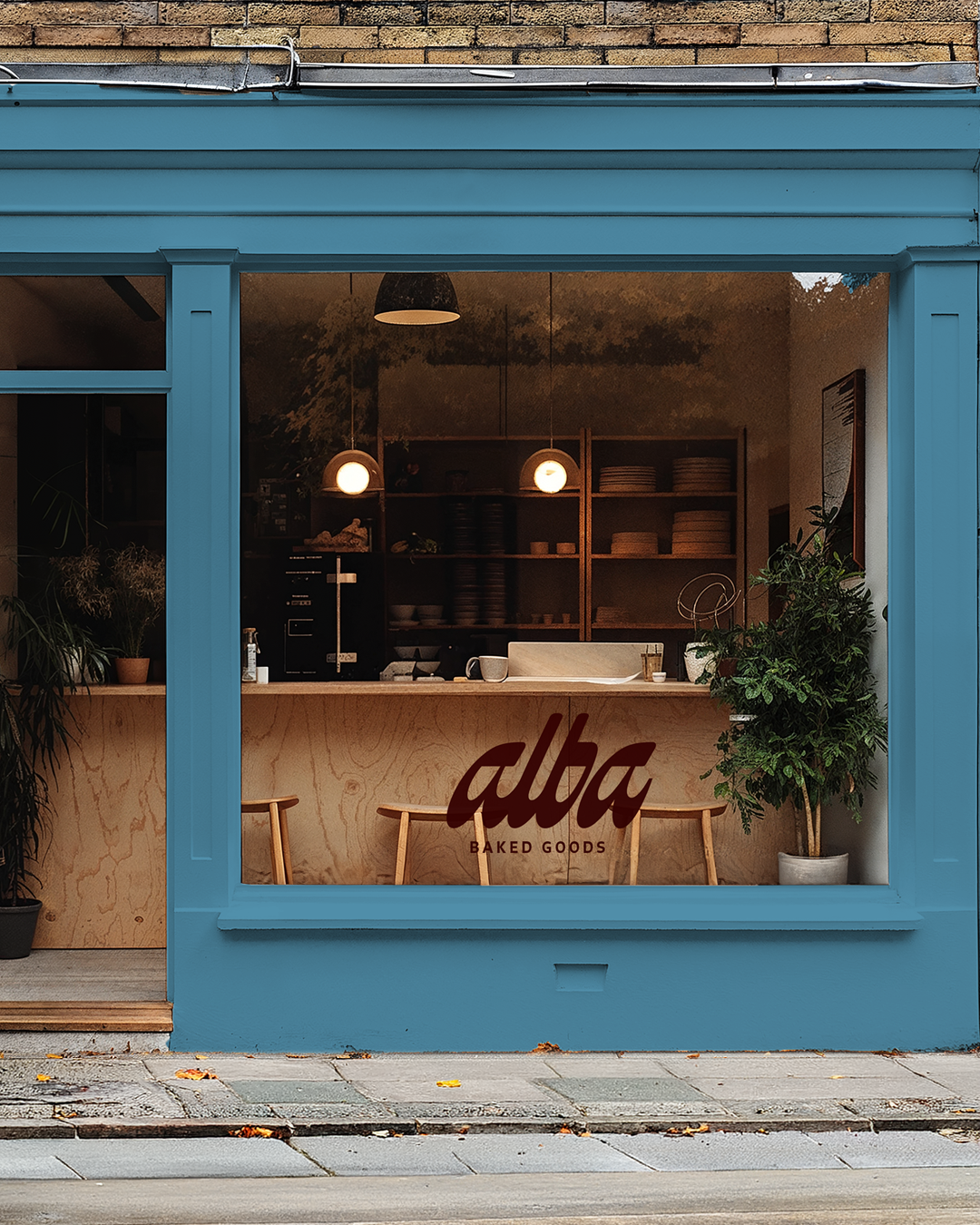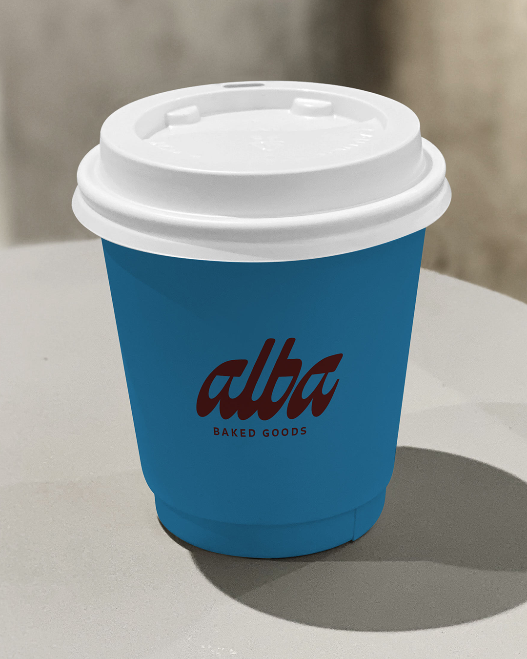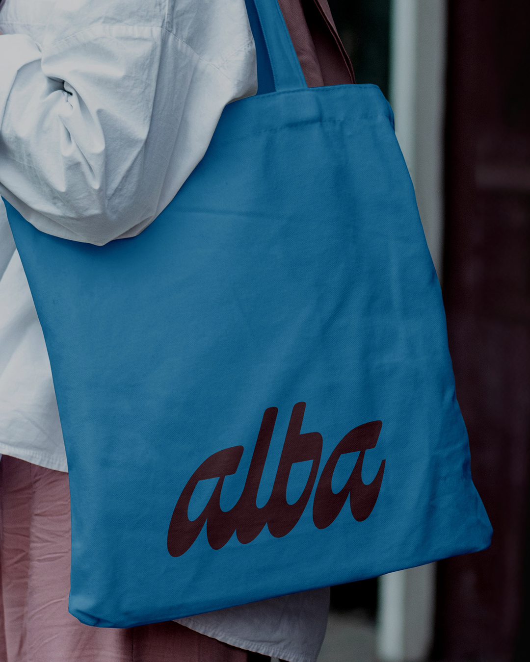
I’ve been working on a run of NDA projects recently, so am not able to talk about them yet. I saw the Creative Boom brief for March and wanted to have some fun creating something I could share with no restrictions. I designed a brand identity for Alba, an independent artisan bakery founded by Italian ex-pat, Marco. After falling in love with a small, quirky English market town, he decided it needed a bakery celebrating craft, community, and the simple joy of something made properly.
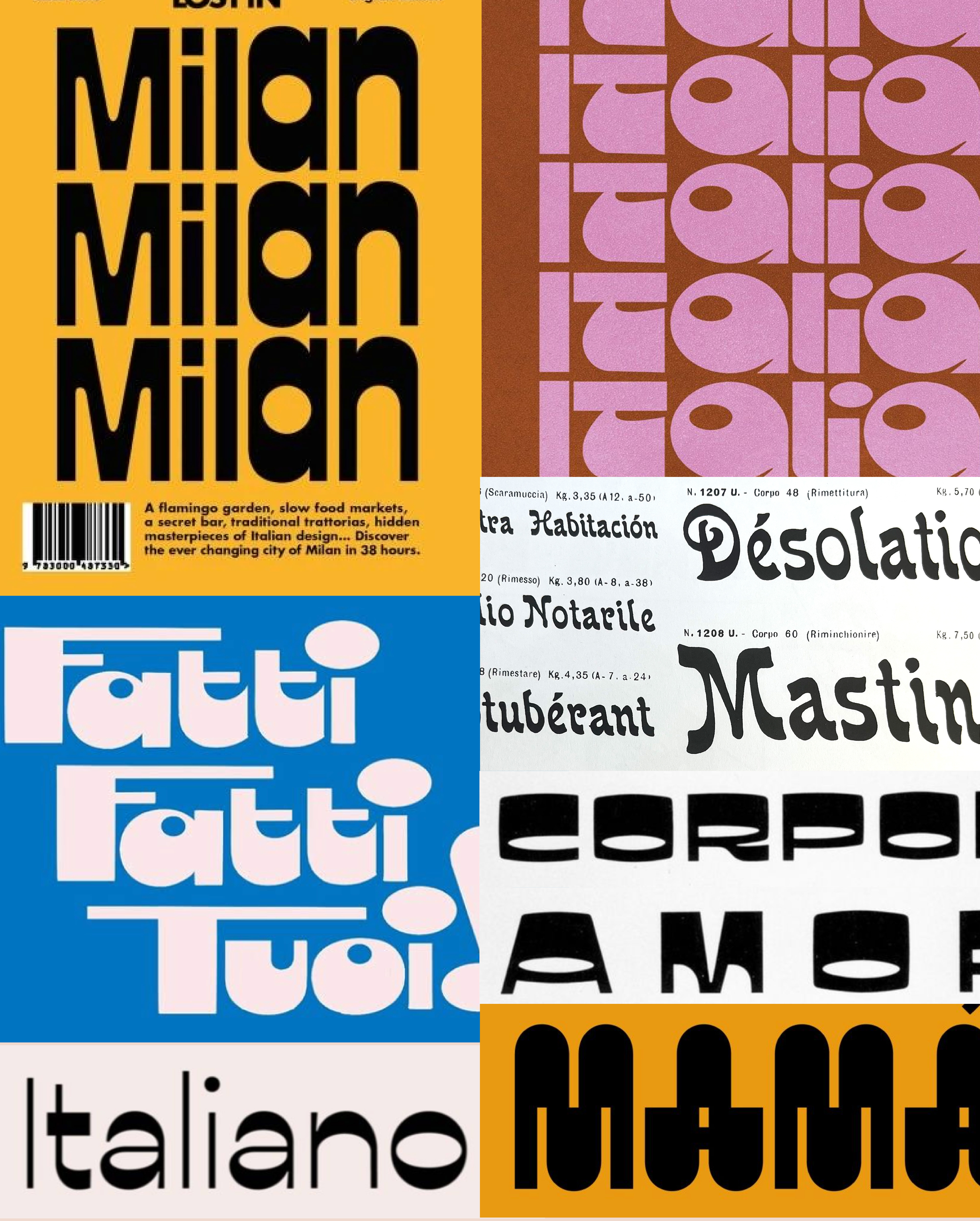
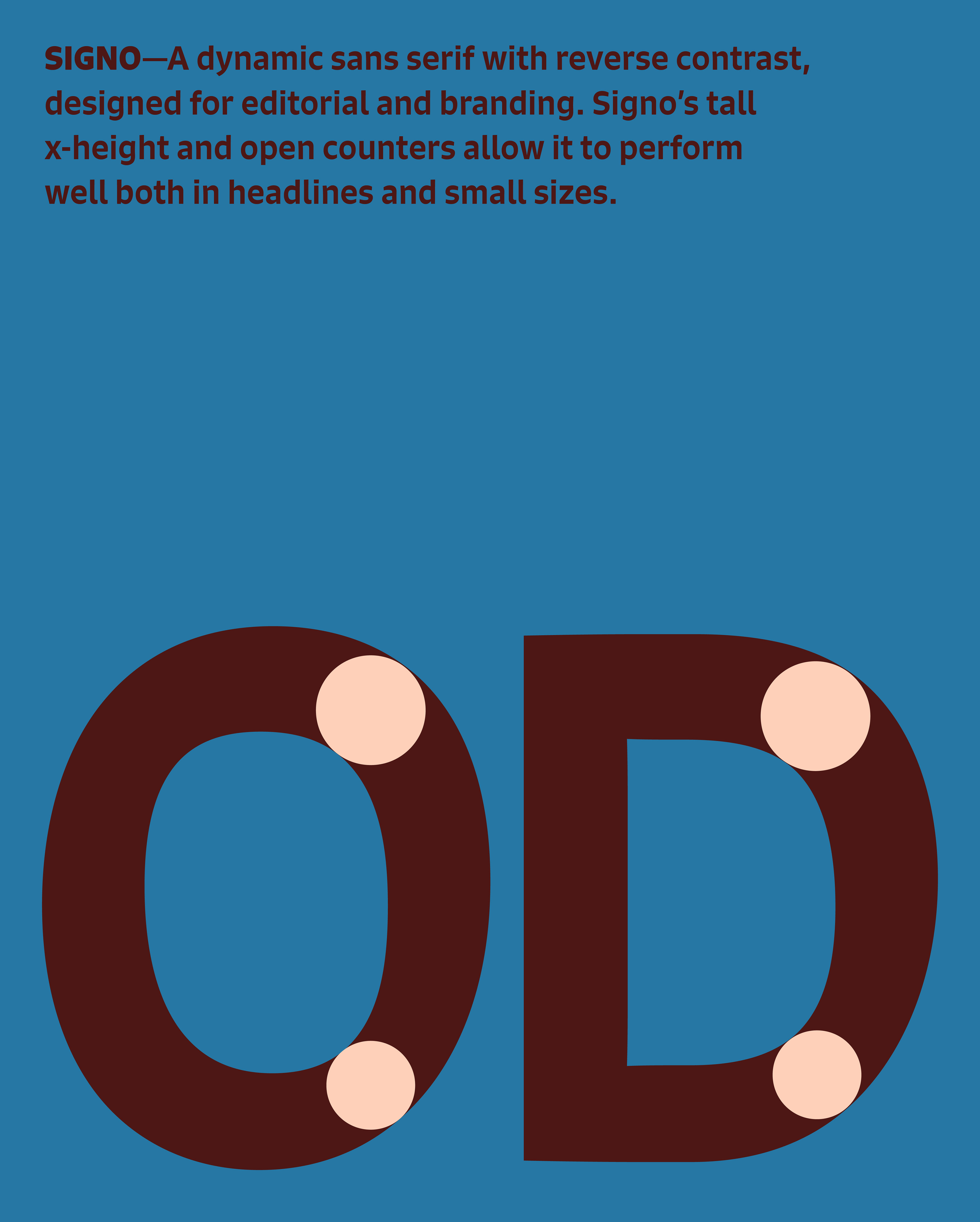
I took cues from Italian signage to create a hand-drawn logo that feels as crafted as the products and as characterful as the town. The understated, slightly unexpected colour palette helps it stand out in a crowded bakery space. What defines Italian signage for me, and something I remember vividly from my travels, is reverse contrast type. It feels distinctly Italian, yet modern and full of personality, striking the balance between a Saturday market town and a Milanese backstreet bakery. I paired my hand drawn mark with a more subtle reverse contrast font called Signo, created by Rui Abreu.